

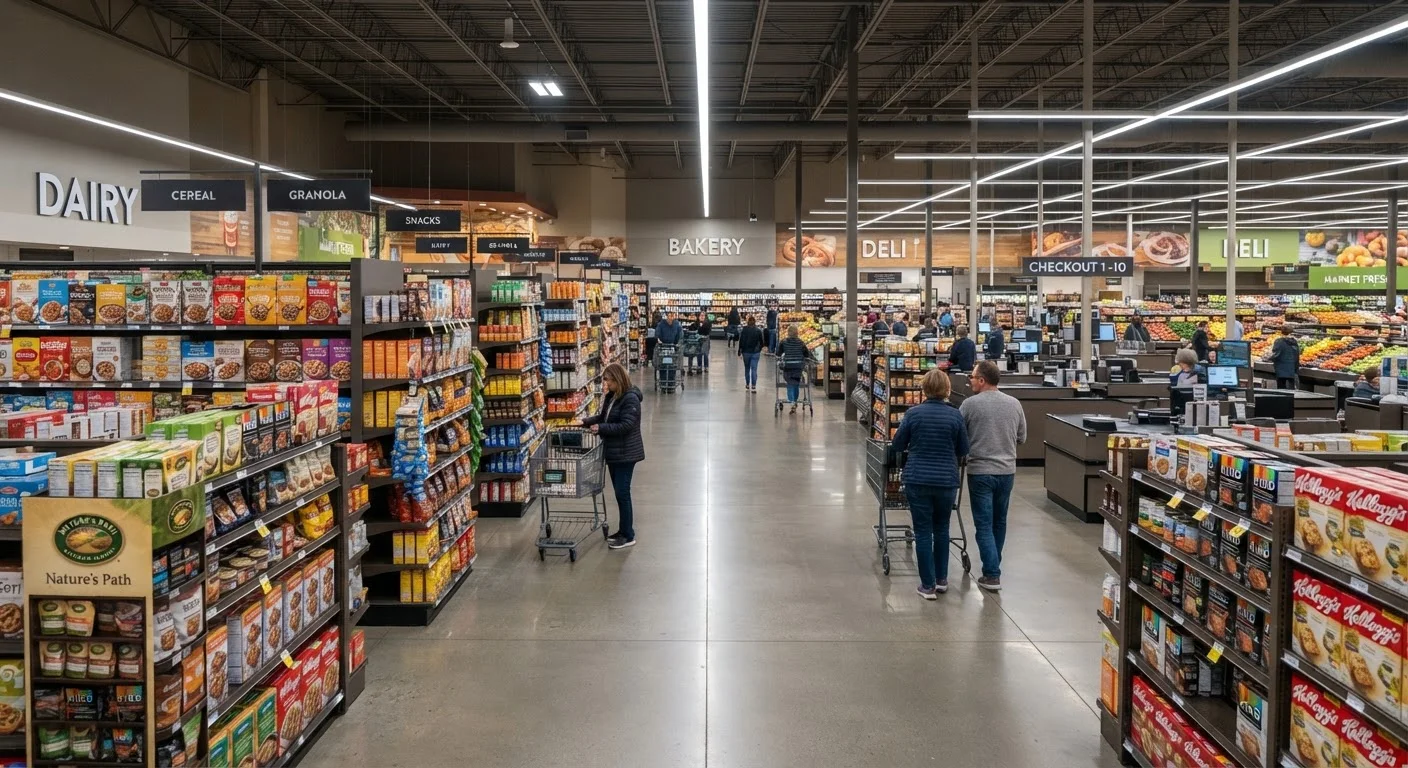
The Store as a Designed Environment
When you walk into a grocery store or a big-box retailer, the experience feels casual — a trip to pick up what you need. But the environment you're navigating was built by architects, behavioral researchers, and merchandising analysts whose job is to understand how people move, look, and decide.
Store layout is one of the most studied areas in retail. Researchers track foot traffic patterns, eye movement, dwell time near displays, and basket size by zone. The result is an environment calibrated to serve the store's commercial interests — which aren't always aligned with yours.
This isn't inherently sinister. But understanding what's happening beneath the surface gives you a clearer picture of why you sometimes leave with more than you planned to buy. For a broader look at how retailers shape the shopping experience before and during your visit, see what retailers know about you before you walk in.
Layout Varies by Store Format
Not all retail formats use the same layout tactics. Discount and warehouse stores often prioritize operational efficiency over behavioral nudges, which can result in less curated but more straightforward navigation. That said, even these formats use strategic placement for high-margin or promotional items. The principles described here apply most directly to conventional grocery stores and mid-to-large general merchandise retailers.
Why Staples Are Never Near the Door
One of the most consistent features of grocery store design is the placement of high-demand staples — milk, eggs, butter, bread — at the back or perimeter of the store. This is not a logistical coincidence. It's a deliberate strategy: to pull shoppers through the entire floor plan before they reach what they came for.
Every aisle a shopper walks down is an opportunity for a product encounter. The longer the path to the destination item, the more SKUs a shopper is exposed to. Studies in retail behavior consistently show that longer shopping trips correlate with higher total spend, even when the original purchase intent was narrow.
This placement strategy works in tandem with aisle orientation and signage. In many stores, aisle signs are designed to orient you toward categories rather than guide you efficiently — keeping you browsing rather than beelining to the exit. See how grocery store zoning reveals broader patterns in how fresh and staple products are organized.
~70%
Of grocery purchases made in-store are unplanned
Research from the Point of Purchase Advertising International (POPAI) has consistently found that a large majority of grocery purchase decisions are made inside the store, not before entering.
30%+
Sales lift for eye-level vs. bottom-shelf placement
Retail merchandising research broadly shows that moving a product from a lower shelf to eye level can increase sales by 30% or more, which is why that space is so commercially valuable.
15–20%
Average basket size increase from longer in-store dwell time
General findings in retail behavior research suggest that shoppers who spend more time in a store tend to purchase more, providing a commercial incentive for layouts that slow navigation.
Shelf Height, End Caps, and the Economics of Visibility
Not all shelf space is equal. Products placed at eye level — roughly between waist and shoulder height for an average adult — consistently outsell those placed on lower or upper shelves. This is well-documented in retail merchandising research, and it's why that premium space is often reserved for higher-margin products or items from brands that pay slotting fees for the positioning.
Children's products are frequently placed at a child's eye level — a deliberate choice that targets the in-store influence kids have on purchasing decisions.
End caps — the displays at the end of each aisle — are another high-value zone. Shoppers naturally slow down or pause at aisle ends, making these spots ideal for promotional items or products the store wants to move. But not everything on an end cap is actually discounted. The visual cue of a featured display can create a perception of value that isn't always backed by a lower price tag.
Checkout lanes operate similarly. The narrow, queued environment ensures you stand next to small, low-cost, impulse-friendly items for several minutes. Candy, magazines, and convenience products at the register aren't there by accident — they're the last sales opportunity before you leave. For a deeper look at how these tactics connect to pricing, loss leaders and what stores really want you to buy explains how below-cost pricing on some items is designed to get you in the door.
What You Can Do With This Knowledge
Awareness of store design mechanics doesn't require you to become a defensive shopper or to distrust every retail environment. It simply means you can walk in with a more accurate model of what's happening around you.
A few practical habits follow naturally from understanding layout strategy: shopping with a written or digital list reduces susceptibility to layout-driven detours; entering the store with a rough sense of where your items are located lets you shop more efficiently; and recognizing that eye-level products and end-cap features aren't always the best value helps you look up, down, and around before grabbing what's most visible.
The tactics covered here are part of a broader set of retail mechanics worth understanding. Shopping strategies worth knowing pulls together a full picture of how to navigate pricing, placement, and retail psychology in everyday consumer decisions. And if you want to go deeper on the specific psychological levers at play, how retailers use store layout to influence what you spend covers the mechanics in more detail.
Shop the List, Not the Layout
Before entering any store, write down what you need — and roughly where in the store those items are. A purpose-built path through the store reduces the chance that a well-placed end cap or eye-level display pulls you off course. This is especially useful in large-format stores designed with non-linear floor plans.
Frequently Asked Questions
Milk is placed at the far end of a grocery store because nearly every shopper needs it. By positioning it away from the entrance, retailers ensure customers walk past many other products before reaching it. This increases the chance of unplanned purchases along the way.
A planogram is a visual diagram specifying exactly where each product should sit on a shelf — which row, which height, how many facings. Retailers and brands use planograms to maximize product visibility and sales. Eye-level positions are generally the most valuable, and brands often pay for that placement.
Yes, in many cases. Slotting fees and shelf placement agreements between retailers and brands are a standard part of the consumer goods industry. Eye-level shelving typically costs more than lower or upper positions because research consistently shows it drives more sales.
Large retailers often use non-linear floor plans with winding paths, destination departments in distant corners, and strategically placed end caps to slow shoppers down. The longer a customer spends navigating the store, the more items they tend to encounter and consider purchasing.
Awareness is a practical tool. Shopping with a list, avoiding the store when hungry or rushed, and recognizing high-margin product zones (checkout lanes, end caps, eye-level shelves) can help you make more deliberate decisions. You don't have to fight the layout — just understand what it's doing.
The content on this site is for informational purposes only and is not a substitute for professional advice. Always consult a qualified professional for guidance specific to your situation.